FUTURA: THE TYPE SPECIMEN
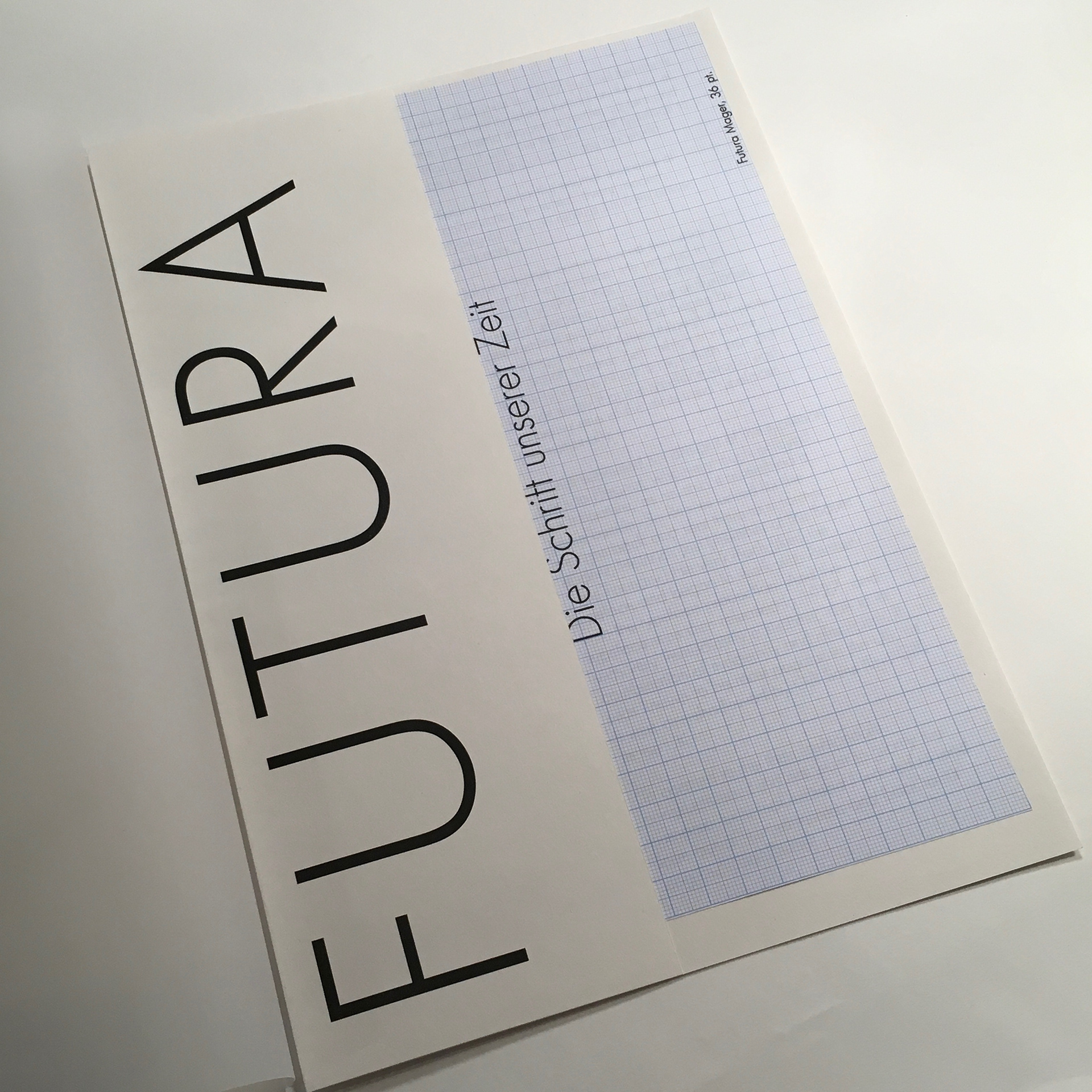
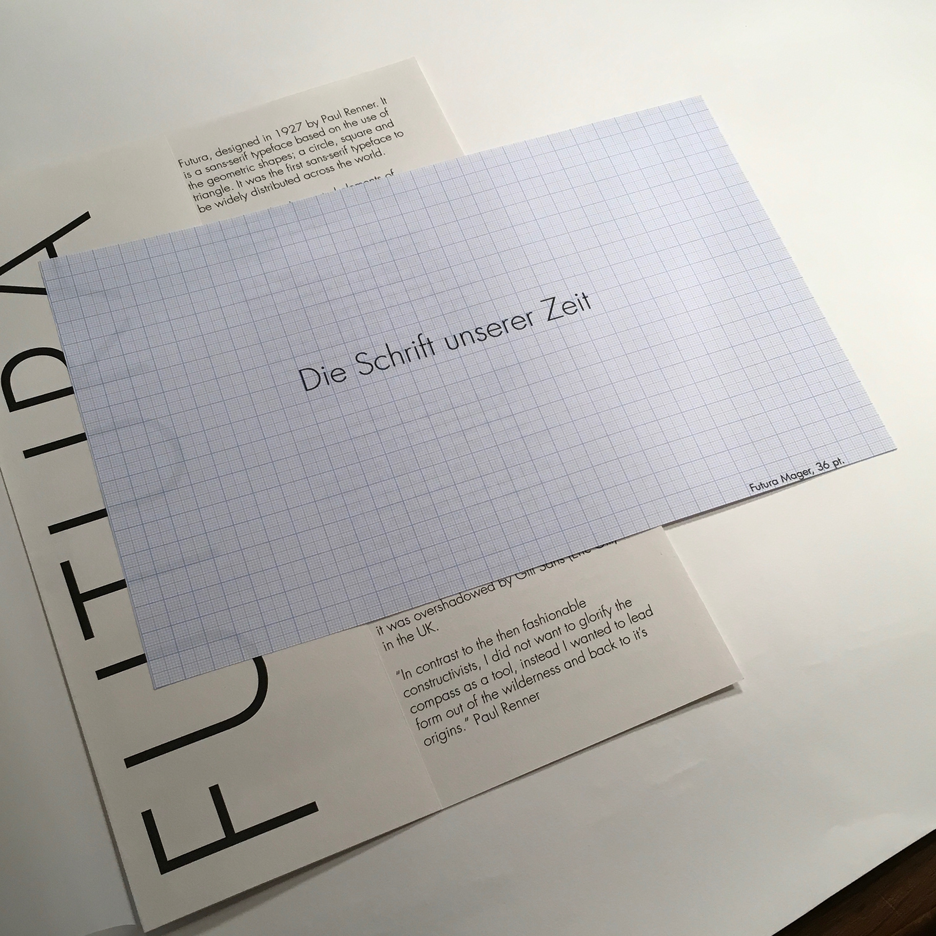
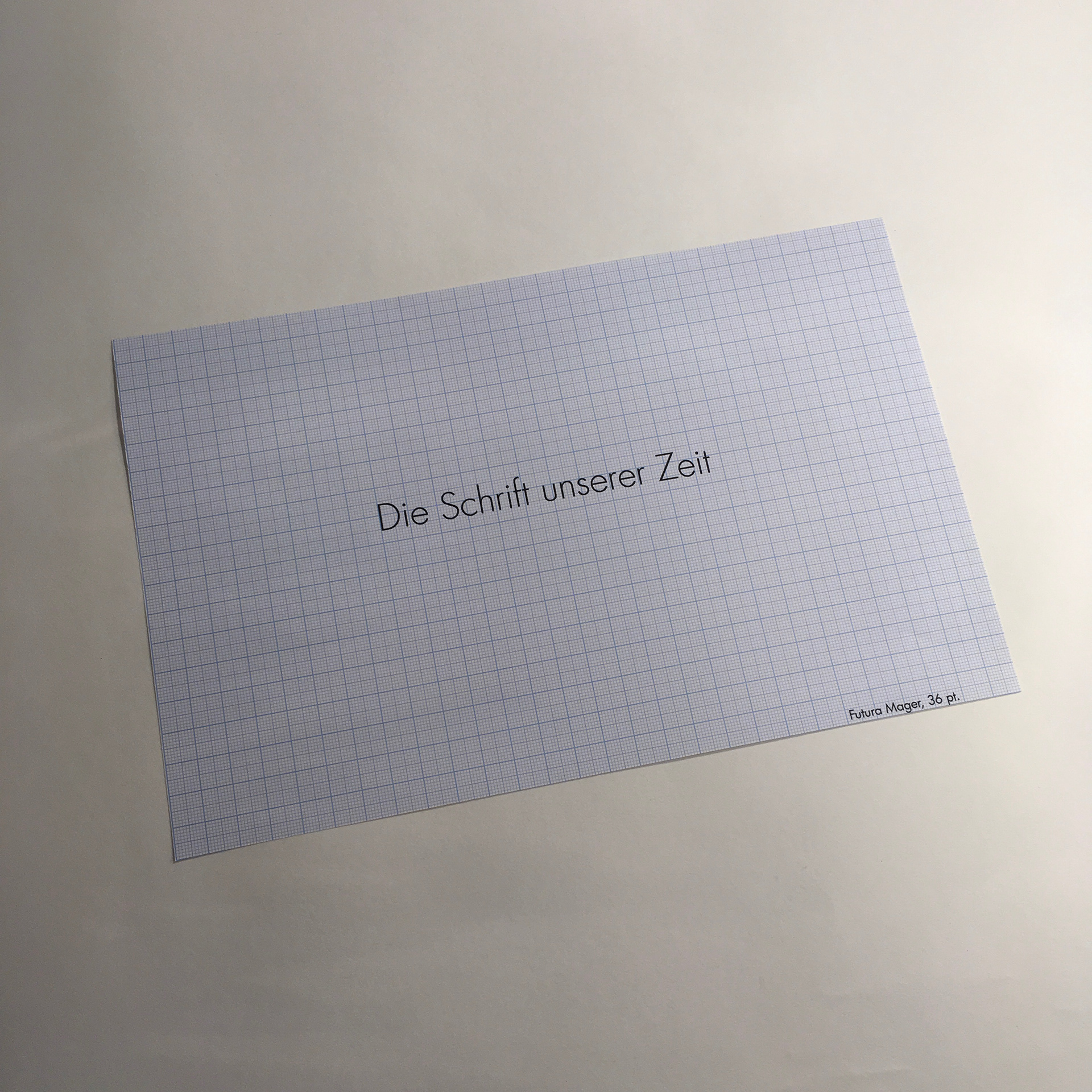
When Paul Renner created the geometric typeface, he truly did not know that it would be the 'Die Schrift unserer zeit' which translates to the typeface of our time. He created the original typeface initial proposal on blue graph paper showing the different versions of the typeface, Original, Light and Bold all in point size 36 (size A4). I replicated this design and created a booklet around the design which explains the history of the typefaces and it's uses in brief.
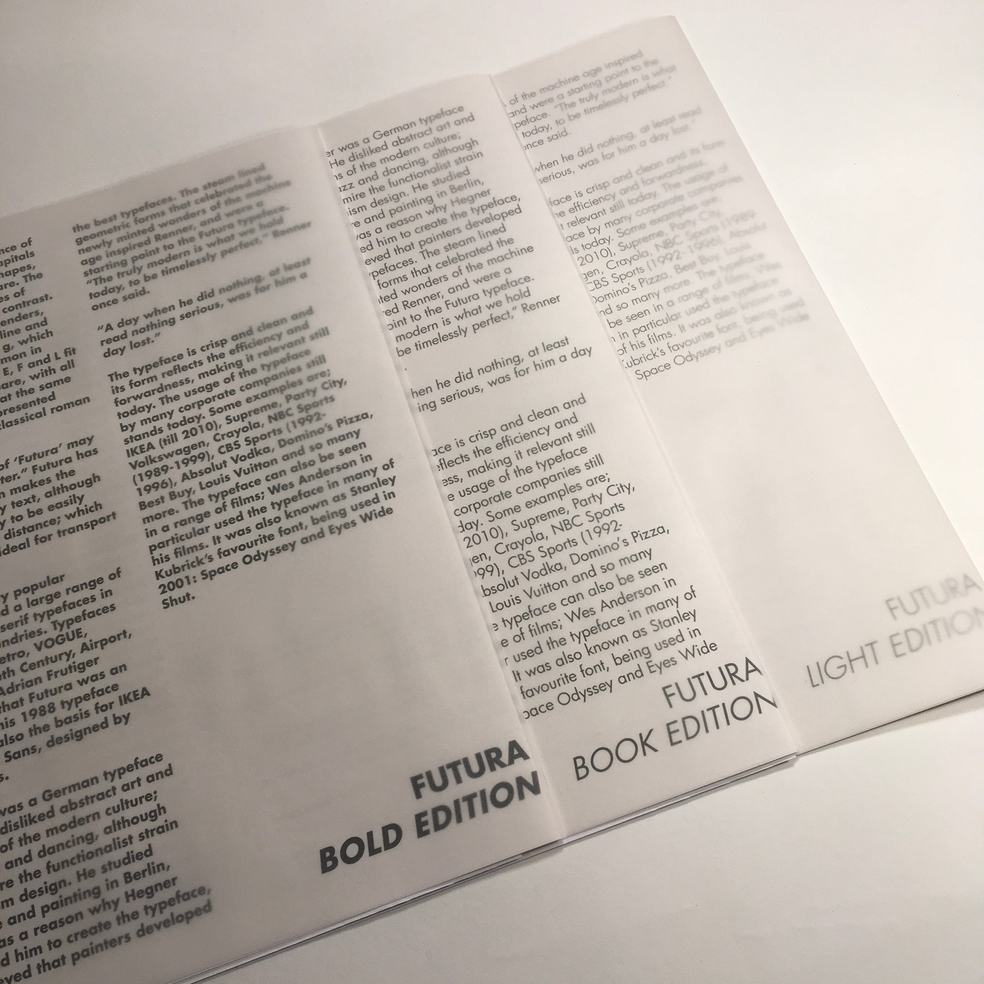
I created an Edition of 3 which showcase the Futura Book, Light and Bold versions of the typeface to show the variations, using norfolk cartridge paper and blue graph paper wrapped in a tracing paperfor the final printed designs.